

Three Types Of Trend:
Up-Trend (higher lows)
Down-Trend
Sideways-Trend (ranging)
On the Up-Trend:
On the Up-Trend the market is moving upward, So you can bye. In the downtrend, the market is down, So you can sell it.
Sideways-Trend:
In the Sideways-Trend, the market revolves around a certain range, So it is best not to trade in the sideways trend.
Some important information about the trend line:
You have to draw a trend line by connecting at least two top or bottom points. However, the trend line is confirmed if there are 3 points.
Price and trend lines like the support and resistance lines will test the trend lines, the stronger the trend lines. If you do not try to force the trend line. In that case, it will not be a valid trend line.
Chart Patterns
What Are Forex Chart Patterns?
Forex chart patterns are on-chart price action patterns that have a higher than average probability of follow-through in a particular direction.
These trading patterns offer significant clues to price action traders that use technical chart analysis in their Forex trading decision process. Each chart pattern has the potential to push the price toward a new move.
Thus, Forex traders tend to identify chart patterns in order to take advantage of upcoming price swings.
Continuation Chart Patterns
Pennant Chart Pattern:
The pennant is a corrective/consolidating price move, which appears during trends. It resembles a symmetrical triangle by shape, as both are bound by trendline support and resistance lines. The difference is that pennants typically occur during a trend phase, while triangles can be formed during both trends and general consolidation periods.
Pennants could be bearish or bullish depending on the trend direction. When a pennant occurs during a trend, it has the potential to push the price in the direction of the overall trend. The expected move is usually a measured move, meaning the target from the breakout point equals the size of the pennant itself.
Below is an illustration of Pennants:
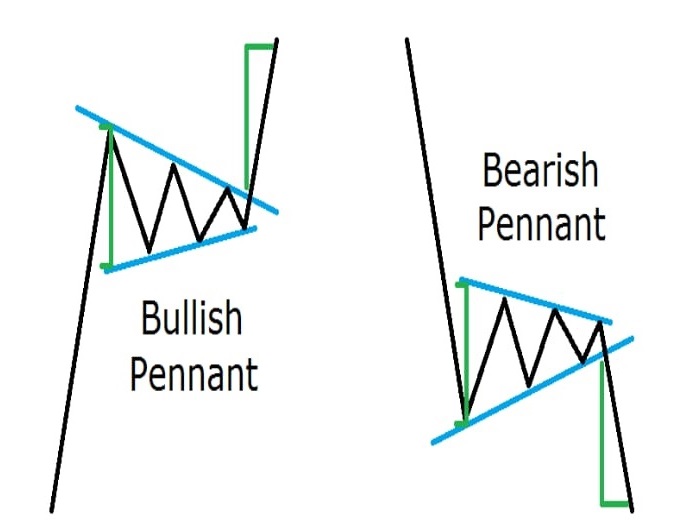

The green lines indicate the size of the pennant and measures the expected price move, which equals the size of the pennant.
When you trade a pennant you should open your position whenever the price closes a candle beyond the pennant, indicating confirmation of the formation.
At the same time, your stop loss should be placed right beyond the opposite level of the pennant.
Rectangle Chart Pattern:
The rectangle chart pattern is a trend continuation formation, which resembles price consolidation within horizontal support and resistance levels.
During a trend, when the price starts moving sideways forming a rectangle, another trending move is likely to occur once the price eventually breaks out of the rectangle formation.
This move is likely to be at least as big as the size of the rectangle. Rectangles could be bearish or bullish depending on the trend direction.
Take a look at the illustrations below for the Rectangle formations:


When you trade rectangles, you should put a stop loss beyond the opposite extreme of the formation. Notice that this trading pattern is similar to the pennant, the difference is the swings of the rectangle formation occur within the same price zone.
Corrective Wedge Pattern:
We have a rising wedge when the price closes with higher tops and even higher bottoms. We have a falling wedge when the price closes with lower bottoms and even lower tops.
Wedges are very interesting chart patterns. The reason is that wedges could be a trend continuation or trend reversal formation.
Reversal Chart Patterns:
I will start with the reversal wedges because the previous chart patterns we discussed were the corrective wedges. This way you will see the difference between these two.
Reversal rising/falling wedges look absolutely the same way as corrective rising/falling wedges. The difference, though, is the relation between the wedge and the trend direction.
Every rising wedge has bearish character. This means a rising wedge reverses bullish trends and continues bearish trends. At the same time, every falling wedge has a bullish character. So, falling wedges reverse bearish trends and continue bullish trends. Still not getting it?
Have a look at the image below:


You see? The reversal wedges are absolutely the same as the corrective wedges in appearance. The difference is where they appear in relation to the trend. When a reversal wedge occurs at the end of a trend, it has the potential to push the price to an opposite movement equal to the wedge itself. When you trade reversal wedges you should place your stop-loss order right beyond the level, which is opposite to the wedge breakout.
Double Top and Double Bottom Patterns / Triple
Top and Triple Bottom Patterns:
These are another example of reversal chart patterns. We have a double top pattern when after an uptrend the price creates two tops approximately on the same level. And on the contrary, we have a double bottom pattern when after a downtrend the price creates two bottoms approximately on the same level. It is absolutely the same as the triple top and triple bottom formations. The difference, though, is that the tops and bottoms here are three and not two.
This is how these formations look:


The green lines here indicate the size of the formation and its respective potential. We determine the size when we take the highest top and the lowest bottom of the formation.
When we confirm the authenticity of these trading patterns, we expect a price move equal to the size of the formation. This is typically referred to as a 1 to 1 measured move.
Head and Shoulders Pattern(Reversal):
This is one of the most reliable chart patterns in the technical analyst’s arsenal. Head and shoulders are a reversal formation and indicate a topping reversal after a bullish trend.
At the same time, this chart pattern has its opposite equivalent – inverted (or inverse) head and shoulders.
The inverted head and shoulders typically appear after a bearish trend and calls for a bottom in price.
Below you will find illustrations of this pattern:


As you see, the head and shoulders formation really looks like a head with two shoulders. After an uptrend, the price creates a top, then it corrects. It creates a second, higher top afterward, and then it drops creating a third, lower top – head and shoulder.
It is the same with the inverted head and shoulders but instead of an uptrend we have a downtrend and instead of tops the price creates bottoms, as shown in the image above.
The bottoms forming the head are two points that create the signal line of the formation. This signal line is called the Neck Line.
When the price closes a candle beyond the neckline, the head and shoulder formation is confirmed and we can enter the market with the respective position.
This position should be short in case of head and shoulders and long in case of inverted head and shoulders. Your stop loss should be placed right above the last shoulder of the formation.
Ascending/Descending Triangle Pattern(Reversal):
The ascending triangle has tops, which lay on the same horizontal line and have higher swing bottoms.
The descending triangle has bottoms, which lay on the same horizontal line and lower swing tops. Although many people consider these chart patterns as neutral, their chance to reverse the trend is a bit higher.
Thus, I put them with the trend reversal chart patterns.
This is how the ascending and the descending triangles look:


As you see, ascending and descending triangles are very similar to the rising and falling wedges.
The difference is that rising wedges have higher tops and falling wedges have lower bottoms while ascending triangles have horizontal tops and descending triangles have horizontal bottoms.
When an ascending/descending triangle is confirmed, we expect a reversal price movement equal to the size of the formation.
This is shown with the green lines on the image above. The stop loss should be placed right beyond the horizontal level of the triangle.
Candlestick
What is a candlestick?A candlestick is a way of displaying information about an asset’s price movement. Candlestick charts are one of the most popular components of technical analysis, enabling traders to interpret price information quickly and from just a few price bars.
It has three basic features:
The body, which represents the open-to-close range
The wick, or shadow, that indicates the intra-day high and low
The color, which reveals the direction of market movement – a green (or white) body indicates a price increase, while a red (or black) body shows a price decrease.
Over time, individual candlesticks form patterns that traders can use to recognize major support and resistance levels.
There are a great many candlestick patterns that indicate an opportunity within a market – some provide insight into the balance between buying and selling pressures, while others identify continuation patterns or market indecision.
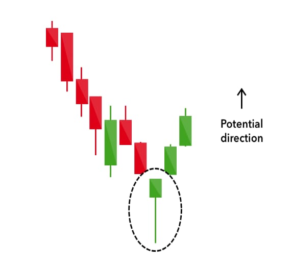
Hammer(bullish):
The hammer candlestick pattern is formed of a short body with a long lower wick and is found at the bottom of a downward trend.
A hammer shows that although there were selling pressures during the day, ultimately a strong buying pressure drove the price back up.
The color of the body can vary, but green hammers indicate a stronger bull market than red hammers.
Inverse Hammer(bullish):
A similarly bullish pattern is the inverted hammer. The only difference being that the upper wick is long, while the lower wick is short.
It indicates a buying pressure, followed by a selling pressure that was not strong enough to drive the market price down.
The inverse hammer suggests that buyers will soon have control of the market.


Bullish engulfing:
The bullish engulfing pattern is formed of two candlesticks. The first candle is a short red body that is completely engulfed by a larger green candle.
Though the second day opens lower than the first, the bullish market pushes the price up, culminating in an obvious win for buyers.


Piercing line(bullish):
The piercing line is also a two-stick pattern, made up of a long red candle, followed by a long green candle. There is usually a significant gap down between the first candlestick’s closing price, and the green candlestick’s opening.
It indicates a strong buying pressure, as the price is pushed up to or above the mid-price of the previous day.

Morning star(bullish):
The morning star candlestick pattern is considered a sign of hope in a bleak market downtrend. It is a three-stick pattern: one short-bodied candle between a long red and long green. Traditionally, the ‘star’ will have no overlap with the longer bodies, as the market gaps both on open and close.
It signals that the selling pressure of the first day is subsiding, and a bull market is on the horizon.

Three white soldiers(bullish):
The three white soldiers pattern occurs over three days. It consists of consecutive long green (or white) candles with small wicks, which open and close progressively higher than the previous day.
It is a very strong bullish signal that occurs after a downtrend and shows a steady advance of buying pressure.

Hanging man(bearish):
The hanging man is the bearish equivalent of a hammer; it has the same shape but forms at the end of an uptrend.
It indicates that there was a significant sell-off during the day, but that buyers were able to push the price up again. The large sell-off is often seen as an indication that the bulls are losing control of the market.

Shooting star(bearish):
The shooting star is the same shape as the inverted hammer, but is formed in an uptrend: it has a small lower body and a long upper wick.
Usually, the market will gap slightly higher on opening and rally to an intra-day high before closing at a price just above the open – like a star falling to the ground.

Bearish engulfing:
A bearish engulfing pattern occurs at the end of an uptrend. The first candle has a small green body that is engulfed by a subsequent long red candle.
It signifies a peak or slowdown of price movement and is a sign of an impending market downturn. The lower the second candle goes, the more significant the trend is likely to be.

Evening star(bearish):
The evening star is a three-candlestick pattern that is the equivalent of the bullish morning star. It is formed of a short candle sandwiched between a long green candle and a large red candlestick.
It indicates the reversal of an uptrend and is particularly strong when the third candlestick erases the gains of the first candle.

Three black crows(bearish):
The three black crows candlestick pattern comprises of three consecutive long red candles with short or non-existent wicks. Each session opens at a similar price to the previous day, but selling pressures push the price lower and lower with each close.
Traders interpret this pattern as the start of a bearish downtrend, as the sellers have overtaken the buyers during three successive trading days.

Dark cloud cover(bearish):
The dark cloud cover candlestick pattern indicates a bearish reversal – a black cloud over the previous day’s optimism. It comprises two candlesticks: a red candlestick which opens above the previous green body and closes below its midpoint.
It signals that the bears have taken over the session, pushing the price sharply lower. If the wicks of the candles are short it suggests that the downtrend was extremely decisive.

Doji(continuation):
When a market’s open and close are almost at the same price point, the candlestick resembles a cross or plus sign – traders should look out for a short to the non-existent body, with wicks of varying length.
This doji’s pattern conveys a struggle between buyers and sellers that results in no net gain for either side. Alone a Doji is a neutral signal, but it can be found in reversal patterns such as the bullish morning star and bearish evening star.

Spinning top(continuation): The spinning top candlestick pattern has a short body centered between wicks of equal length. The pattern indicates indecision in the market, resulting in no meaningful change in price: the bulls sent the price higher, while the bears pushed it low again. Spinning tops are often interpreted as a period of consolidation, or rest, following a significant uptrend or downtrend.
On its own, the spinning top is a relatively benign signal, but it can be interpreted as a sign of things to come as it signifies that the current market pressure is losing control.

Falling three methods(continuation): Three-method formation patterns are used to predict the continuation of a current trend, be it bearish or bullish.
The bearish pattern is called the ‘falling three methods’. It is formed of a long red body, followed by three small green bodies, and another red body – the green candles are all contained within the range of the bearish bodies.
It shows traders that the bulls do not have enough strength to reverse the trend.

Rising three methods(continuation): The opposite is true for the bullish pattern, called the ‘rising three methods’ candlestick pattern. It comprises of three short reds sandwiched within the range of two long greens. The pattern shows traders that, despite some selling pressure, buyers are retaining control of the market.

What Are Technical Indicators?
Technical indicators are heuristic or mathematical calculations based on the price, volume, or open interest of a security or contract used by traders who follow technical analysis.
Leading vs. Lagging :
Lagging indicators are typical "output" oriented, easy to measure but hard to improve or influence while leading indicators are typically input-oriented, hard to measure, and easy to influence.
Let me illustrate this with a simple example:
For many of us, a personal goal is weight loss. A clear lagging indicator that is easy to measure. You step on a scale and you have your answer. But how do you actually reach your goal? For weight loss, there are 2 “leading” indicators: 1. Calories are taken in and 2. Calories burned. These 2 indicators are easy to influence but very hard to measure. When you order lunch in a restaurant the amount of calories is not listed on the menu. And if you are me, you have no clue how many calories you burn on a given day.
Now let's try to translate this to business. Most financial indicators such as revenue, profit, costs are “lacking indicators”. They are the results of the activities of the company. Now let's imagine you are managing an IT outsourcing company and your goal is to be compliant with the SLA’s (service level agreements) you agreed upon with your customers. For instance, the maximum allowed time to resolve high priority incidents is 48 hours.
The output is easy to measure:
You either solve your incidents in 48 hours or not. But how do you influence the outcome? What are the activities you must undertake to achieve the desired outcome? For instance: Make sure staff start working on incidents immediately when they occur. Make sure that incidents are assigned to the right people with the right skill set and that this person isn’t already overloaded with other work.
This could be translated into the following “leading” indicators.
- % of incidents not worked on for 2 hours.
- % of open indicates older than 1 day.
- % of incidents dispatched more than 3 times.
- The average backlog of incidents per agent.
When you would start measuring these KPIs on a daily basis and focusses on improving these KPIs, I would think it is extremely likely to see an improvement in SLA compliance. Leading indicators are often related to activities undertaken by employees. Remember our personal example? Losing weight is not an activity, exercise and eating are.
Chart Overlays:
Technical Indicators are the often squiggly lines found above, below, and on-top-of the price information on a technical chart. Indicators that use the same scale as prices are typically plotted on top of the price bars and are therefore referred to as “Overlays”.
Chart Studies:
Chart Studies use a stock's price movements, volume, and other historical information to attempt to find patterns that may indicate shifting price trends.
By learning what a particular study may be indicating and then applying that study to your charts, you may be able to identify trading opportunities, points of support or resistance at certain price thresholds, price trends, and more.
Moving Averages:
In technical analysis, the moving average is an indicator used to represent the average closing price of the market over a specified period of time. Traders often make use of moving averages as it can be a good indication of current market momentum.
The two most commonly used moving averages are the simple moving average (SMA) and the exponential moving average (EMA). The difference between these moving averages is that the simple moving average does not give any weighting to the averages in the data set whereas the exponential moving average will give more weighting to current prices.
Purpose of MA:
The main purpose of the moving average is to eliminate short-term fluctuations in the market. Because moving averages represent an average closing price over a selected period of time, the moving average allows traders to identify the overall trend of the market in a simple way.
Usage of Moving Averages:
There are 3 ways in which trader’s use the moving average:
To determine the direction of the trend
To determine support and resistance levels
Using multiple moving averages for long- and short-term market trends
1. To determine the direction of the trend:
When prices are trending higher, the moving average will adjust by also moving higher to reflect the increasing prices. This could be interpreted as a bullish signal, where traders may prefer buying opportunities.
The opposite would be true if the price was consistently trading below the moving average indicator, where traders would then prefer selling opportunities due to the market signaling a downward trend.
2. The moving average for support and resistance levels:
The moving average can be used to determine support and resistance levels once a trader has placed a trade.
If the trader sees the moving average trending higher, they may enter the market on a retest of the moving average. Likewise, if the trader is already long in an uptrend market, then the moving average can be used as a stop loss level. The opposite is true for downtrends.
The charts below are examples of how the moving average can be used as both a support and a resistance level.
3. Making use of multiple moving averages:
It is common for traders to make use of multiple moving average indicators on a single chart, as depicted in the chart below. This allows traders to simultaneously assess the short and long-term trends in the market. As price crosses above or below these plotted levels on the graph, it can be interpreted as either strength or weakness for a specific currency pair. This method of using more than one indicator can be extremely useful in trending markets and is similar to using the MACD oscillator.
When making use of multiple moving averages, many traders will look to see when the lines will cross. This phenomenon is referred to as ‘The Golden Cross’ when a bullish pattern is formed and ‘The Death Cross’ when the pattern is bearish.
A Golden cross is identified when the short-term moving average (such as the 50-day moving average) crosses above the long-term moving average (such as the 200-day moving average), while the Death cross represents the short-term moving average crossing below the long-term moving average. Traders that are long, should view a Death Cross as a time to consider closing the trade while those in short trades should view the Golden Cross as a signal to close out the trade.

Oscillators: An oscillator is a technical analysis indicator that varies over time within a band (above and below a centerline, or between set levels). Oscillators are used to discover short-term overbought or oversold conditions.
MACD
What is the moving average convergence/divergence?: The moving average convergence/divergence (MACD) is a technical analysis indicator that aims to identify changes in a share price's momentum. The MACD collects data from different moving averages to help traders identify possible opportunities around support and resistance levels.
Convergence means that two moving averages are coming together, while divergence means that they’re moving away from each other.
The MACD indicator is made up of three components:
The MACD line, which measures the distance between two moving averages
The signal line, which identifies changes in price momentum and acts as a trigger for buy and sell signals
The histogram, which represents the difference between the MACD and the signal line
When calculating the MACD, only two lines are taken into consideration: the MACD line and the signal line. The MACD line is created by subtracting the 26-period moving average from the 12-period moving average. The signal line is the 9-period moving average of the MACD.
The MACD is then displayed as a histogram, a graphical representation of the distance between the two lines. If the MACD cuts through the signal line from below, traders could use it as a buy signal and if it cuts the signal line from above, traders might use it as a sell signal.